

Welcome to part IV of our exclusive web series, Get Digital WithSachin Karweer, Business Head – Hinduja Global Solutions Interactive. This series has covered quite a bit of digital ground over the last few weeks, right from why your website needs a digital marketing strategy to signs that your website needs repair and the latest customisation trends in the market.
Over to Sachin Karweer for his latest knowledge share, exclusively for the smart professionals connected with tvnews4u.com.
– ChiefMentor, tvnews4u.com
TRACKING THE TRENDS:
GIVE YOUR WEBSITE A DIGITAL MAKE-OVER
We haven’t even begun to touch the tip of the digital iceberg yet, so let’s explore another aspect of this fascinating field – the trends of 2016 in website development.
The web is a rapidly evolving universe where everything is always in motion, an accelerated evolution that one must keep up with in order to gain an advantage over the other players.
Website design and development trends often span several years — even over a decade — for some kinds of designs, languages and back-end platforms. Web design also consists of user interfaces, backend coding,site architecture and usability, along with its visual presentation.
Credibility has a direct connection to how likely potential users are going to convert into customers. Simply put, this means you lose customers if your website is poorly developed. So I can’t emphasise enough how important it is to internalize the indisputable truth that you convey your brand’s trustworthiness and legitimacy by the quality of your website.
Web development is a playground for web designers and developers, and it has evolved as a rich medium with strong functional and aesthetic appeal. At present, we’re still working with some of those trends like performance and speed, and perfecting the user experience. A successful website demands staying updated with the current web development and design trends.
Implementing the latest styles and techniques allows businesses to be competitive and increases their marketability. So far, the year 2016 has brought with it some fantastic changes in design and technology. Here’s a look at some of the trends I think we’ll see more of this year and those that I believe will shine:
Push the boundaries of the future of web apps with Isomorphic/Universal JavaScript
2016 is arguably the year of isomorphic JavaScript. Traditionally, JavaScript was the language of the web browser and performed computations directly on the user’s machine, which is known as‘client-side’ processing. Today, in web development, an isomorphic or universal JavaScript is a code that can run on both, the server and the client side.Exploding in popularity, and backed by new libraries and frameworks, Isomorphic JavaScript is able to solve issues associated with traditional JavaScript frameworks.
What is also promising is its ability to allow front-end developers to easily create 100% SEO compliant web applications and components that are structured and accessible on several devices. The benefits of Isomorphic applications are many, one being the ability to convert web applications into mobile apps with the help of Cordova, for instance. These apps can run both — server-side as well as client-side. This offers many advantages like faster speed, SEO-friendly design and easier code maintenance.
Achieve a crisp and unified layout with Flexbox
In my opinion, the best part of being in an era of digital evolution is the advances we get to experience first-hand. One of these is the Flexbox layout. Simply put, Flexbox is a layout model that allows easy alignment and distribution of space within a container and its elements on a website. Its purpose is to provide an extremely efficient way to lay out and align a website’s design. We can see how this will be helpful when accommodating different sizes of displays and screens and how this adds to a universal experience across devices.
At its heart, Flexboxenables designers to build gridc systems without depending on CSS floats, complicated percentages for widths or hacks for equal height columns, thus the word ‘flex’ for flexible.
As an advanced CSS property, Flexbox has been steadily gaining popularity and its usage is expected to soar much more this year with advances in browser technology and Microsoft now pushing users to IE11 and Edge on the latest operating systems.
Micro-interactions – great design is all in the little details
We may not know this, or even notice it as it happens, but micro-interactions happen all around us, on all our devices, the websites we visit, the apps we download and even the appliances in our homes. They are the secret ingredient that keep users engaged.
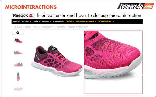
In fact, you’ll be surprised to know that it’s quite likely you started your day with a micro-interaction.
Let me explain. Every time you turn off your alarm, update your status, “like” something, or even reply to a message, you are interacting with a micro-interaction. It’s often an interaction that takes place without a second thought; for example, on your smartphones or tabs, by pulling down on the screen of your social network timeline, you know your entire feed will be refreshed – i.e. you engaged with a user
interface in a single moment with the expectation that it works. This is the beauty of micro-interactions — they appeal to a user’s need to be immediately acknowledged and when it is successfully implemented, it can guide users with the help of visual cues, haptic feedback, etcetera.
Micro-interactions should be an important part of any digital design project you have in mind. Let’s take the example of Letterboxd, a movie social site, that usescaptchas from popular movie quotes, making for a clever micro-interaction. In keeping with the website’s movie theme, ittransforms an otherwise annoying task into a fun one.
Another quick example of a smart micro-interaction can be seen on Yelp which, on any public holiday, alerts users to call in advance before visiting a restaurant. Nowthat’s what you call a helpful micro-interaction.
With all the fuss about good looking designs, it’s crucial to prioritise functionality
I agree that websites should be stunning to the eye, but these days, the average internet user looks for more than just beauty.Having a well-designedwebsite is great, but with three-second patience thresholds, that won’t hold any value if the website doesn’t function properly.
Today’s users are net-savvy and are aware when something doesn’t work well on a website. If they’re unhappy with their experience, we all know where they will head to voice their displeasure; and criticism on social media or the internet in general is what can make or break a brand’s image.
To give you a clearer picture, especially for an e-commerce website, it can spell disaster if users encounter something that isn’t functioning as it should on their user journeywhen purchasing a product.As a brand, it would mean you’ve lost the customer, as well as the opportunity to make a sale. Plus you’ve left the customer with a deeply embedded unpleasant memory of wasted time and effort and the deep disappointment at not being able to consummate the purchase of an item s/he had her/his heart set on. Now that’s branded the site in that user’s mind as an unreliable one; one that the user would go to only if all others couldn’t offer the product or service. In fact, ease and reliability of use and functionality can often supercede costs if they are marginally different across competing ecommerce websites.
So, When the website comes to life in the development stage, it should be thoroughly tested for functionality. It’s important to note here that functionality can only be truly defined once you know your target audience, so research is a critical part of functionality
Developers and designers should be driven by the goal to strike a balance between good website functionality and its visual appeal — this year, and in the years to come.
Simplify your navigation with the handy hamburger menu
The chances that you’ve already seen and interacted with a hamburger menu are quite high. It is often featured on the top right or left corner of many websites, mobile or desktop, and also makes a common appearance in tablet and mobile apps. This signature design consists of three stacked lines, resembling a hamburger. It’s also sometimes called a side menu or a navigation drawer.
The main aim of hamburger menus or the 3-lined menu icon is to simplify navigation, especially in the mobile UX design, where space is often inadequate. Although, as mentioned above, it is a trend that has also seeped into a variety of devices, web apps and platforms.
A hamburger menu allows a site to incorporate an entire menu without taking up too much space, as it only reveals the menu when you interact with the element, thus making the website look sleeker and clutter-free, enhancing theuser experienceas well as the site’s design aesthetic. To illustrate, The Guardian redesigned its website with most of its navigation hidden behind this always-accessible hamburger menu.In 2015, many designers became advocates of killing off the hamburger menu, but my best guess is that it is here to stay and peacefully coexist with navigation.
Say it like you mean it with the help of ty.pog.ra.phy
We’ve all heard that first impressions are often the last, which is why typography gets a mention in this list. What most brands miss is that their typography helps in creating an image before their customers have even read a line.
Typography can neverbe ignored as it helps create an ambience for the final look and feel, much like the tonality and imagery of a brand’s content, thus making it a crucial part of website designing. It can be used for logos, headings, menus and key messages. The overall requirement to typography will always stay the same: fonts should be legible on both, high-resolution and lower-resolution screens, andshould always be pleasing to the eyes.See, there could be a entire book on typography and the experts could still say much more about it, but that’s not the scope of this piece.
Experience pretty pixels with minimalism and flat design
It’s no hidden fact that a website’s design can impact whether a user trusts a brand or a company. 94% cite that they do not trust certain websites owing to their design aesthetic. We are currently in the era of minimalism, and flat design goes hand-in-hand with it. The benefit of a minimalistic theme is that it strips the visuals down to the basics, minimising all of the showy stuff that distracts from the main story.
What works in its favour is its quick loading time, as a minimalistic design often reduces the load of a website, allowing it to load faster. Another advantage is being able to decrease the amount of materialthat readers have to deal with, making their user journey precise and deliberate.
It alsoscales well on multiple devices, while retaining its quality of being easy to read on mobile devices. This year, look out for sharp edges, thin lines and solid colours – they should work like magic.
Make a statement with card-layout interfaces
Microsoft, along with Pinterest, put card-layouts on the map, and we saw lots of tile-based designs in 2015. They seem to be on almost every website, adding style, functionality and interactivity.
Besides looking good, card layout interfaces provide opportunities to add more information usingpretty visual animations, like flipping, expanding and hover effects. They are a great design element as theyallow a site to showcase several products or content pieces in a smaller given space. Cards also help make the content easy to see and consume at a glance, which happens to be wheremost users are likely to convert or click on your product.
The card layout design has been so successful in the web development world that it has also seeped into a number of apps, especially social apps like Reddit and Twitter, to name just two. This just shows that this design style is here to stay a while. Another bonus is that they work almost seamlessly across devices because they can be‘stacked’ across or down the screen, or both.
Long scrolling – to scroll or not to scroll?
I have been watching sites with long, infinite scrolling with immense interest as they are fast cementing themselves as a staple in website designing. At present, there are more longer scrolling sites than shorter scrolling sites; this has got a lot to do with mobile users steadily overtaking desktop users. Why? Because scrolling becomes a necessity when one is on a smaller screen. It’s quite simple, really — the smaller your device screen, the more you need to scroll.
Faster internet access is also another factor in the rise of the long scroll, as users no longer have to wait for long load times to access information, as opposed to clicking a new page and waiting for it to load. Social sites have also given this trend a tremendous push; case in point — Facebook, Reddit and Twitter’s infinite scroll timelines.
When long scrolling is combined with card layouts, it allows for a seamless and infinite stream of bite-sized content that is idealfor user consumption, especially on mobile. However, only time will tell which works best for users.It will be fun to watch the scrolling battle play out this year.
Nothing says it better than your own images
The usage of stock photos is soon becomingoutdated. If this is surprising news to you with the plethora of stock image sites available in the market, let me explain why. A stock image can often never truly capture your brand’s concept and feel, irrespective of how professional and accurate it may seem. The biggest advantage of owning your photography is that, unlike in stock images, it will always be unique and original to your brand and you will be showing your users something they’ve never seen before. This approach endears your brand’s unique identity while promoting the company’s image in your user’s mind.
Therefore, I foresee that this year is all about using one’s ownimagery.What users want is authenticity and naturalness that custom original photography offers.Thus, the value of original photography will become more pronounced.
Hero your video headers and sliders for maximum impact
Making a good first impression is imperative and one of the first things your site should aim to achieve. Hero headers, imagesand videos are typically located at the top of a website and are what your user sees first. They have become a prominent trend as they can immediately lift the design of a page, while adding depth and elegance to the overall theme.
Hero images and videos can feature an image, animation, illustration, loop or any other type of content, whichever you decide to pick, ensure that you relate your hero headers to your site’s content. Also,it should be aesthetically appealing and complement the rest of your website’s branding.
Bring images to life with cinemagraphs and animation
65% of senior marketing executives feel that video, illustrations and photos are keyto telling your brand’s story.Adding a small amount of movement within a static image can make it look alive and more appealing. To state an example, the ‘live pictures’ on Apple’s latest iPhone models capturea small movement in a picture, making it dynamic, and it’s already taking social media by storm.(You can experience the movingcinemagraph in frozen in the image alongside, here)
Animations like parallax scrolling, spinners, loading bars and those triggered by mouse hoversare being used more than ever before to enhance a website’s storytellingcapability and boost interactivity. In the coming year, websites will see a lot of rich illustrations and incorporation of handmade artwork.
And to sign off, here are a few special mentions, where we are heading and key takeaways
In addition to this list, I have to make a few special mentions. It’s going to be a great time for the wearable app market,with Apple and Samsung leading the way. Other wearables like Microsoft bands, Oculus Rift and other VR tech are steadily making their way to the fore. As these devices permeate the market, there will be a need to design and develop websites and apps keeping accessibility to these devices in mind.
IDTechEx predicts thatthe market for wearable technology will reach $70 billion by 2025.By the time you finish reading this, five more new devices may have sprung up! The challenge is to come up with efficient ways tohandle smaller, oddly-sized screens and interfaces.Talking of screens, split-screens will maintain its presence on the web, offering two distinct sections of contrasting content, allowing you to head to where you are more likely to convert.
There are 1.2 billion mobile web users worldwide. According to the IAMAI-KPMG report, India is believed to have 236 million mobile internet users by this year. It further projects that the mobile internet user base will reach 314 million by 2017. As per thelatest MAIT report, smartphone sales rose 33% during the fiscal year 2014-2015.These figures just go to show how big an opportunity it is for e-commerce, social networking sites, apps and other platforms.
Luke W, who coined the term, mobile-first,believes that brands should cultivate their website for mobile devices. Flipkart and its ownedportal,Myntra,have already dabbled inbuilding a mobile-first product for the fashion-and-net conscious consumers of today.
What can yield better results for your website is an understanding of the latest trends in web development and better communication with your web developers. It’s important to understand that sometimes, a popular trend is not always the best choice, as what is popular may not always work for your brand, but these tools are good to have should the need arise. There is not one answer to which web development trend can help yourdigital headquarters. It depends on your brand, how well you know your target audience, how these elements work to convey your brand’s message and how much you’re willing to invest in developing your website.